

Energy Drink Logo
This energy drink logo is aimed at a younger audience. The logo uses arrows to symbolize going in different directions. This symbolizes the renew aspect/cycle of the product.
Designed originally in 2018, redesigned in 2022
Remaking of the logo
Originally, the logo was designed in 2018. The remake intends to improve the overall movement of the logo. The original design had some interesting concepts, but it was too stale for a logo that represents an energy drink.

Original logo, 2018
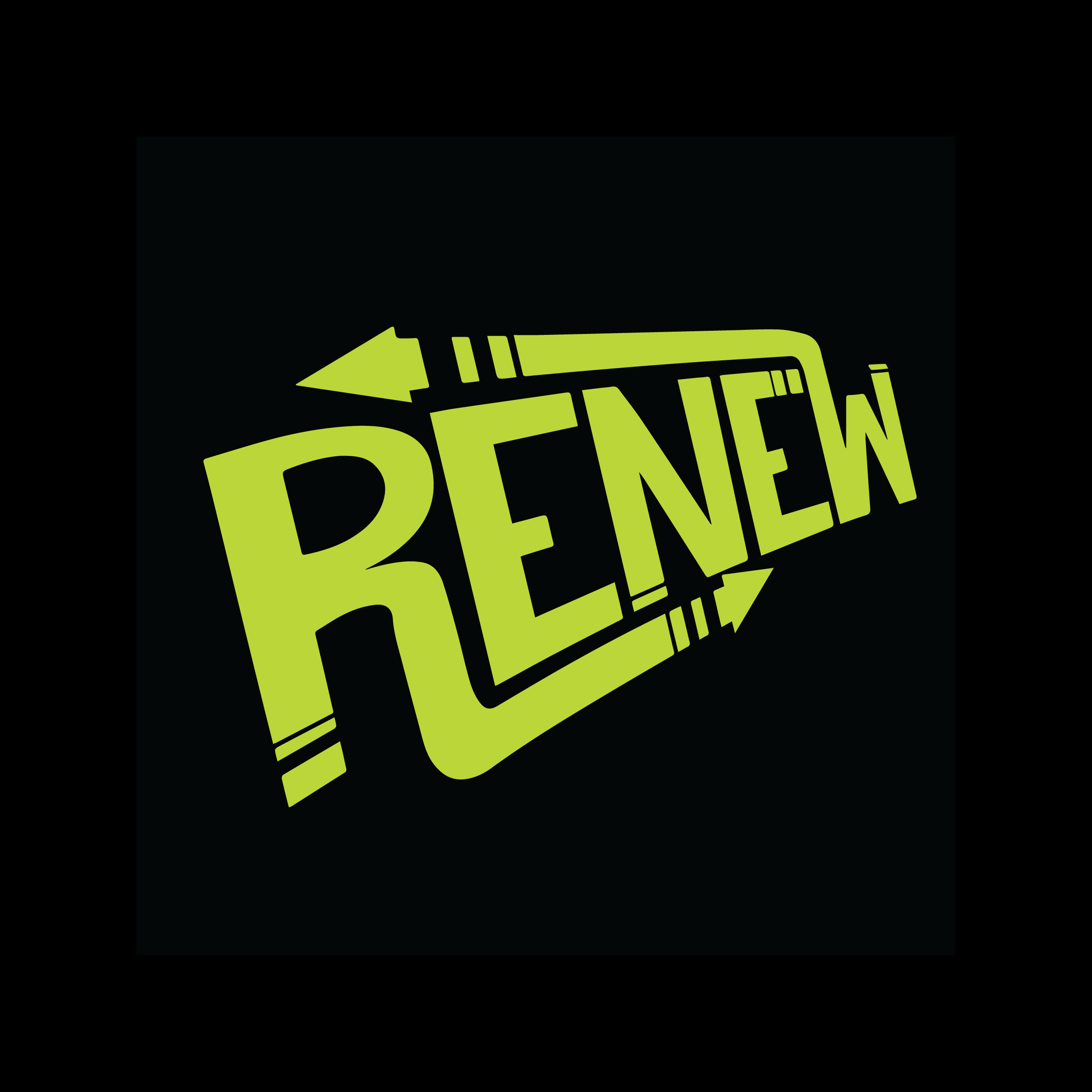
Remake logo, 2022
